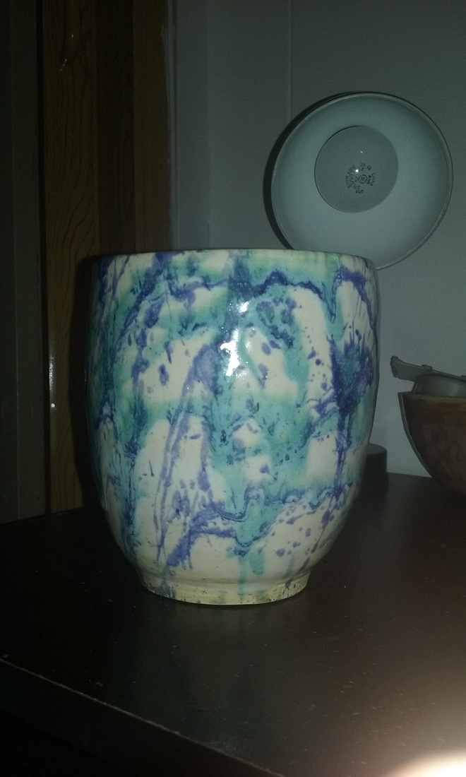
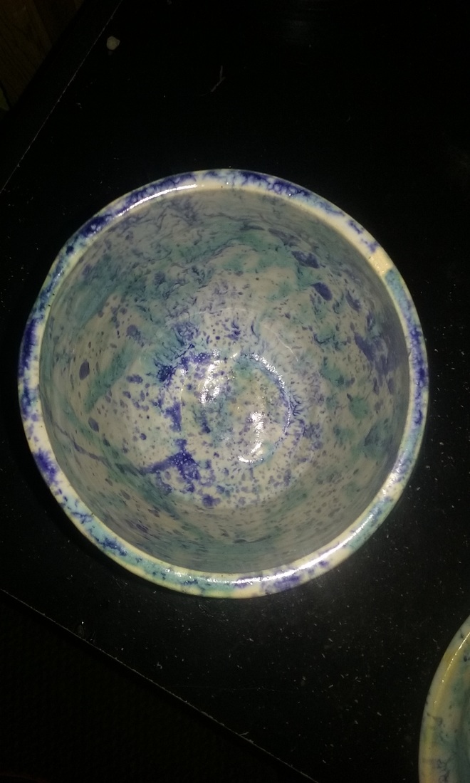
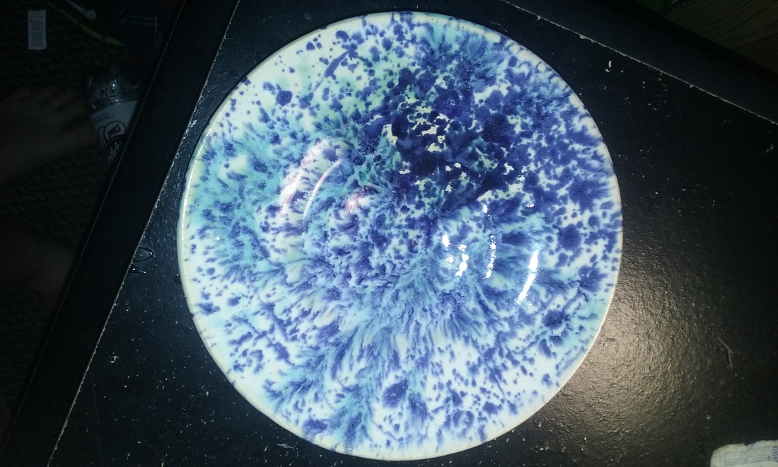
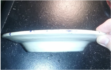
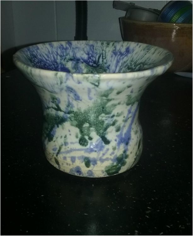
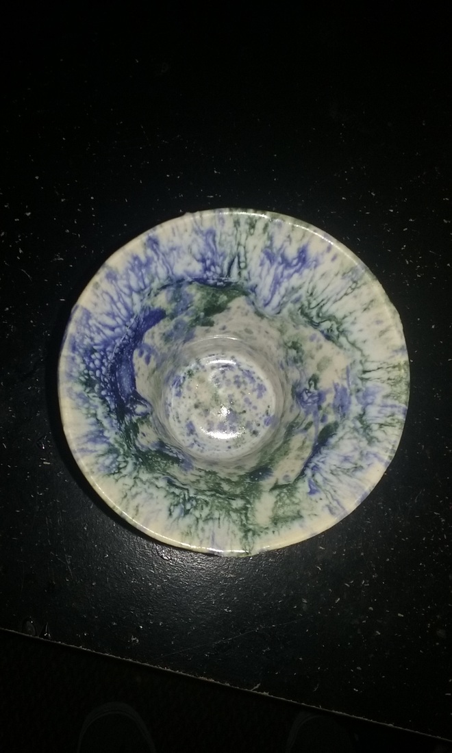
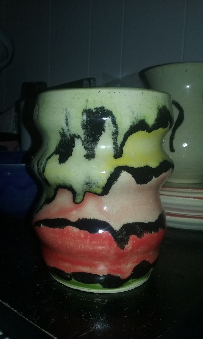
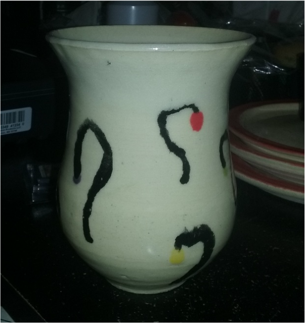
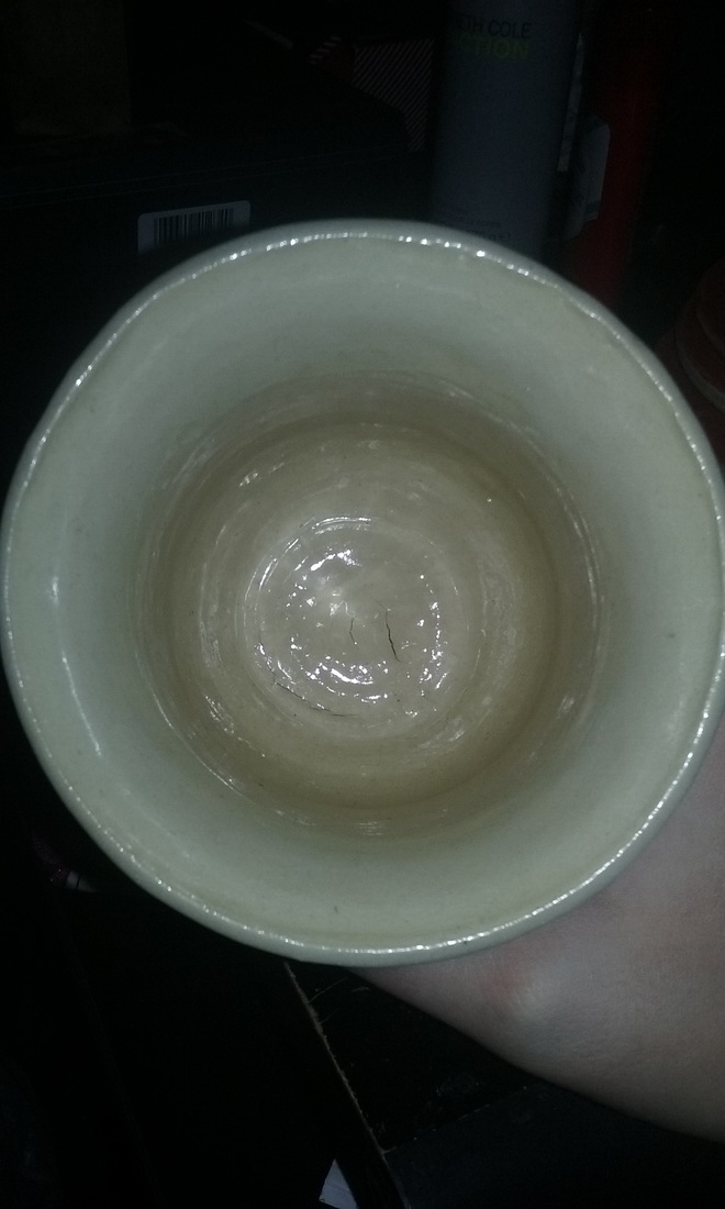
This is an extra credit vase I threw on the wheel. The project is about 9 inches tall and 4 inches wide. The colors I used on this project were a white glaze, mystery blue, and toothpaste in a splatter glaze. A new skill I learned while making this project was using cement to repair a crack that formed on the bottom of the vase on the outside only. An art element I used in this project is space, represented by the large area on the inside for putting various things in. A design element I used while making this project was proportion, as I made sure to make the vase tall enough to have that large of an inside without looking off-scale. A feeling or mood I wanted to convey in this project was professional, as it is one of the best project I have made and I felt like the glaze was a perfect match to the project.
This is an extra credit project I threw on the wheel. It is a small tea plate. The plate is about 5 inches wide and about 2 inches tall. The colors I used on this plate was white, cobalt, and toothpaste with a gradient going from light to dark. A new skill I learned making this project was how to focus a splatter glaze in certain areas in order to make a certain display. An art element I used in this project was form, represented by the larger base in which it sits on. A design element I used in this project was unity, as the glazing looks like it belongs together by the way it fired together. A mood I wanted to convey in this project was to fit something small, like cookies or a biscuit, in comparison to a plate that would normally hold a lot.
This is an extra credit project I threw on the wheel. It is a small vase. The size of the vase is about 4 inches tall, 3 inches wide at it's largest point, and 2 inches wide at it's smallest point. The colors I used on this project was white, cobalt, and forest green in a splatter glaze. A new skill I learned while making this project was keeping my fingers in an even fashion in order to make sure the vase kept on center. An art element I used in this project was color, represented by the tones of the splattered glazes on the vase. A design element I used in this project was unity, as the colors on the vase are usually tied together and fit well for the scheme of the project. A mood I wanted to convey in this project was not a shelf-sitter, but something you could use to hold various items.
This is my second choice project for this quarter. I chose a serving bowl because I found that most of my bowls were rather small on the width, so I wanted to go for a wider one. The bowl is about 9 inches across, while it is about 3 inches tall. The colors I used on this project were similar to my previous plate, being toothpaste, cobalt, and white. A new skill I learned on this project was using different ratios of different colors to make a new color combination after firing. An art element I used in this project was space, represented by the area from opposite sides of the rim and how wide it is. A design element I used in this project was proportion, represented by the shorter height of the bowl and the larger width for a real serving bowl. The mood I wanted to convey in this project was to show enough space so a person would believe they could eat out of it if they wanted to.
This is my first choice project for this quarter. For this choice I chose a large plate because it was one of my best skills. The plate is about 9 inches wide and about 1 inch tall. The colors I used on this project was a white glaze, then on top of the white I splattered on a toothpaste color and light cobalt. A new skill I learned during this project was splatter glazing a project rather than dipping or painting. An art element I used in the project was color, represented by the unique splatter glazing. A design element I used in the project was balance, as the project is even on all sides. The mood I wanted to convey in this project was to make a glaze that made you want to eat off the plate rather than stare at it on a shelf. Quoting Daniella, "I'd eat off this plate!".
This is my two plates project thrown on the wheel. The larger plate is about 8.5 inches across while the smaller one is about 7.5 inches across. The plates both have a higher rim that dip down into the base of the plate for food. The main colors are a coating of clear with lime green stain around the rim. A new skill I learned making this assignment was using a foam bat to foot the plates in order to save the rim from being damaged during the process. An art element I used for this assignment was form, shown in the evenness of both the outer and inner rim. A design element I used for this assignment was proportion, shown in the scale of the rim to the inner area of the plate. A feeling or mood I wanted to convey in this project was a summer feel, as the lime green color on the rim fits nicely and would look good outside in the sunshine.
This is my wheel altered project thrown on the wheel. The project is about 6 inches tall and about 3.5 inches wide at it's largest and 3 inches at it's smallest. The wheel altered part about this project was the warping of the clay to make it almost wavy. The colors I used on this project was clear and black stain to separate the multiple colors throughout the surface of the project. A new skill I learned making this project was pushing the project out at a certain point and then choking it in directly after, and repeating that process multiple times. An art element I used was shape in the form of the waviness, and a design element I used was movement in the form of the shape of the project. The mood I wanted to convey in this project was difference from the norm and how it can still look okay even if it is difference.
This project is a set of 3 plates thrown on the wheel. The largest plate is about 8.5 inches across, while the smallest is about 8 inches across. On all of the plates, there is a lip that sits slightly higher than the base, with a dip leading into it for food. The glazes I used on these plates was a clear on all of them, with the lips glazed with a red stain. A new skill I learned during this project was how to make a set of projects look like they belonged together by glazing them similarly. An art element I used for these projects was space in the form of the area to eat food off of, and a design element I used was proportion in the form of making each of them slightly smaller/bigger. The mood I wanted to convey making these projects was professional-looking, but the glaze ran slightly and made it look sloppy in some places.
This is my tall project thrown on the wheel. The project is 6-7 inches tall and 4 inches wide at the largest circumference and 3 inches at the smallest. The glaze I used was a clear, then black and multi colored stains in shapes I saw in a dream I had the night before. The project is smooth on the outside and inside. A new skill I learned making this project was the process of pulling and choking in order to make it taller without being thrown off center. An art element I used was color in the form of the dots and a design element I used was contrast in the form of the black stain on top of the clear stain. The mood I wanted to convey was confusion when looking at the abstract designs I glazed onto it.
This is my second wheel bowl for second quarter. The project is about 6 inches wide and about 4 inches tall. The glaze I used on this bowl was cobalt, as I got tired of doing a clear inside. A new skill I learned doing this project was to bring the lip out slightly to suggest the shape of the inside. An art element I used was shape and a design element I used was movement. The feeling or mood I wanted to convey was making the viewer know the bowl was well made by it's shape and craftsmanship. I also like how the inside base of the bowl looks like a ripple of water.
|
Archives
January 2016
Categories |