 |  |
|
|
Archives
January 2016
Categories |
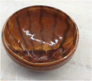
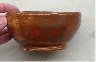
This is my First Bowl assignment final product. The bowl is slightly larger than the size of a palm and is the shape of a bowl, or circle. The surface is flat without any real definition. I used a burnt orange, gray, and red glaze to make a contrast on the outside and inside. The orange is on one side on the outside and the other on the inside, and the same with the gray to create not only a pattern, but a contrast to make a both expected and unexpected effect. The red is in the dots aligning the outside of the bowl. A new skill I learned with this assignment was to use my rib to bring out the bowl and make its shape. The main art element of this project was color in the orange, gray, and red, while the design element was contrast between the colors. The main mood I was going for with this project was Halloween. I wanted to use the orange and gray for a dark feeling, while also reminding the viewer almost of a pumpkin with the color.
0 Comments
|
Archives
January 2016
Categories |
 RSS Feed
