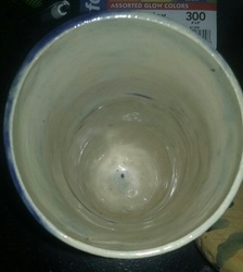
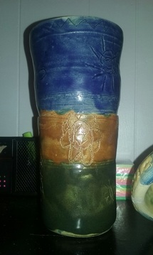
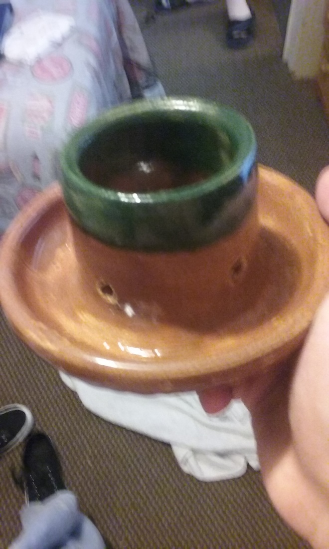
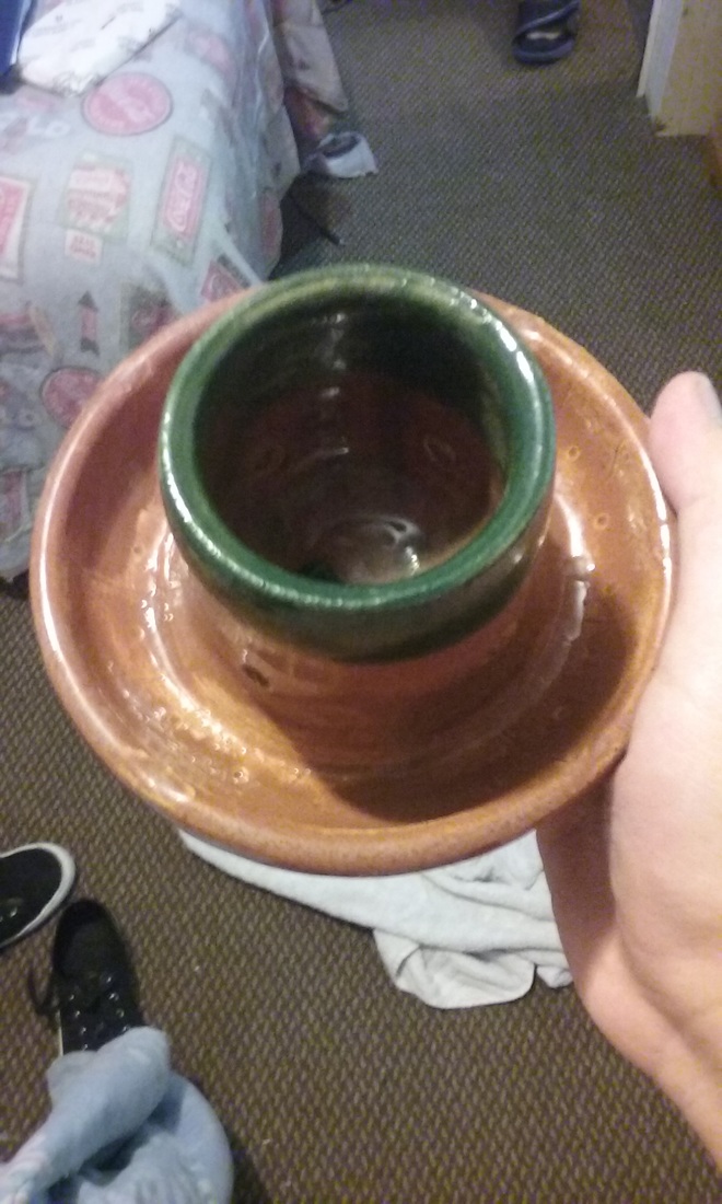
This is the frankenpot made by Jeremy, Kaylee, and Sophia on the wheel. The project is about a foot tall and 3 inches wide. On the outside, we drew various flowers and suns for a artistic effect. For the colors, we used a green on the bottom, burnt orange in the middle, and blue on the top with clear on the inside. A new skill I learned during this project was not only combining 3 different forms together into one piece, but also "footing" the project by rolling it on a table rather than truly centering it, as it is quite tall. An art element for this project was shape, while a design element for this piece was proportion. The mood we wanted to convey was a peaceful piece that gradually got larger as it went up, and by also having drawings on the outside.
This is my first wheel bowl thrown on the wheel for the other half of Semester 1. The bowl is about 7 inches across and about 5 inches tall. The colors I used were a burnt orange with white around the outside with a clear on the inside. A new skill I learned with this assignment was to make a smaller base for the bowl to extenuate the shape of the bowl. An art element I used was shape while a design element I used was balance. A mood I wanted to convey was having enough space for anything you want to eat with the large shape of the bowl.
This is my lidded project thrown on the wheel. The project is about 4.5 inches across and about the same measurement tall while the lid is about 6 inches wide and an inch tall.. The base is relatively smooth while the lid has scratches on it to suggest the appearance of an acorn. I used a blue color on the outside, a clear on the inside, a clear on the lid, and blue splatters on top. A new skill I learned while making this project was throwing a lid and the process of doing so. An art element in this project is form, and a design element in this project is balance. The mood or feeling I wanted to portray was an acorn and the basic shape of one.This project is my cup with a pulled handle, thrown on the wheel. The cup has a curved wall similar to a coffee cup, making it easy told hold in the hand due to it not having any negative space. The colors I decided to use on it were colors I thought would look good together, and make the cup give a brighter feel. I first dipped the cup in a clear glaze, then painted on a red, light green, and dark green stain around the cup wall. I then dipped the handle in a cobalt blue color. A new skill I learned making this assignment was pulling a handle, which I thought would be much harder than it was. An art element I used in this project was shape, as the cup wall is smooth and easy to hold, while the handle fits fingers well and is easier to hold than a flat handle. A design element I used in this project was pattern with my glazing, as I made continuous patterns with the light green and red, while making constant lines around the cup itself. A feeling that this project portrays is brightness and calmness, as a person drinking some of it on an early morning will feel content holding it in their hands.
This project is a vase that I threw but will not use it for my choice project. The vase it about 4 inches tall and about 3 inches wide at it's largest point. My original plan for the color scheme was a white glaze on the outside with dots in a yellow stain, along with purple stain on the inside lip, but it turned out completely white with a blue color on the inside. A new skill I learned from this assignment was to glaze a project with clear glaze under a stain so that the stain does not soak into the clay. An art element that I used was form, which is represented in the potbelly shape. A design element that I used was movement, as the vase looks like it has a natural flow going on. An overall mood that is represented in this project is serenity, as the glaze turned a nice white and I i love how the purple/blue glaze combined with the white to make a blotted color.
This is my Planter project thrown on the wheel. The planter at it's largest diameter is about 5 inches, while the inside is about 2 inches across. around the outer wall of the planter I made small circular indents, along with lines to give it some texture. I also carved holes around the base of the inner part to let any excess water drain out The colors I used on it were brown and green, to represent the dirt and the green that comes from it. A new skill I learned from this assignment was to open something twice in order to make the inner and outer part of a planter. An art element I used in this was shape, as the planter itself has a unique design with the two opened areas. A design element I used was proportion. I made the inner area smaller than the outside because most plants when they start do not need much space, and so I gave it enough space for a plant to start, but then be moved after a little bit. A mood I wanted to convey with this was new life, which was mainly expressed through the colors I used. I thought it was fitting to use green for the upper area where the plant would sprout.
This project is my second bowl. The bowl is about 4in tall and a similar length for the width. I took out clay near the bottom of the bowl with a small circle tool to give it some depth. As for the colors, I was going for a lighter green and blue, but the bowl ended up being a dark green and brown. A new skill I learned from this assignment was to dip the project in the glaze rather than painting it on for a cleaner and more even coat. An art element I used for this bowl was shape. It is not the deep curve that a normal bowl would have, and I intentionally took it in the direction of a straight slope down rather than a drastic curve. A design element expressed would be balance, as the deep colors of the green and brown mesh together to make an overall earth-toned piece. A mood I wanted to convey through this piece was a lighter feel like a late summer with the green and blue, but instead the piece gives an autumn feeling with the deep earth tones.
This project is a vase on the wheel. the vase is about 5in tall and 2 1/2in wide. For this project, I decided to go for a lighter feel, choosing to do a white glaze on the outside with streaks of red and green, with blue on the inside lip. A new skill I learned with this assignment was both bringing the outside outwards while choking the lip to make a sort of "halfway" potbelly vase. An art element in this project is shape, with how the vase looks both wide and slim, and blanance and contrast with how the white makes the other colors stand out while also making it seem, well, balanced. The overall mood I decided to put in this project was the exact opposite of my first bowl project. This vase gives an almost Christmas-y feeling with the white glaze and green/red streaks and a peaceful feeling provided by the white in general.
This is my First Bowl assignment final product. The bowl is slightly larger than the size of a palm and is the shape of a bowl, or circle. The surface is flat without any real definition. I used a burnt orange, gray, and red glaze to make a contrast on the outside and inside. The orange is on one side on the outside and the other on the inside, and the same with the gray to create not only a pattern, but a contrast to make a both expected and unexpected effect. The red is in the dots aligning the outside of the bowl. A new skill I learned with this assignment was to use my rib to bring out the bowl and make its shape. The main art element of this project was color in the orange, gray, and red, while the design element was contrast between the colors. The main mood I was going for with this project was Halloween. I wanted to use the orange and gray for a dark feeling, while also reminding the viewer almost of a pumpkin with the color. |
Archives
January 2016
Categories |