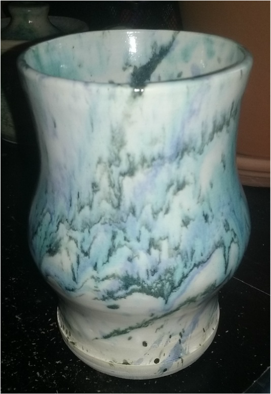
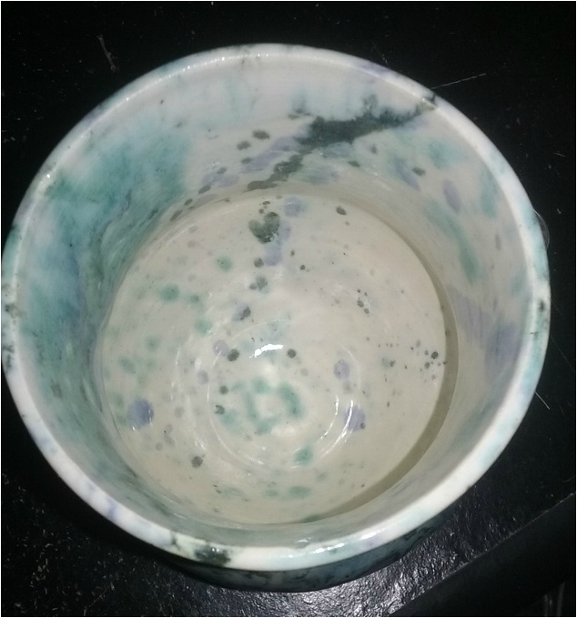
This is my second semester tall project thrown on the wheel. The project is 6.5 inches tall and 3.5 inches wide at it's widest point. Like last semester's I wanted to give my tall project a little more flare by adding a potbelly portion to the vase and making it smooth. The colors I used on this project was a layer of white, followed by a splatter glaze of toothpaste, clear cobalt blue, and shadow green. A new skill I learned while making this assignment was throwing with a different type of clay (this project is sea mix). An art element I used in this project was form, brought out by the design element emphasis on both the potbelly section and the form above that. A mood I wanted to convey with this project was calm, then hectic, then calm again. The way I did this was splattering more glaze in the middle on the project than above or below it.
This is my two large bowl projects thrown on the wheel. The dimensions of the bowls are about 4 inches tall and about 6 inches wide. The glazes I used for both were white, mystery blue, clear cobalt, and toothpaste. A new skill I learned while making this project was drip glazing, which turned out slightly worse than what my expectations were. An art element I used while making these bowls was texture, as there is a carved out design on the base of both bowls. A design element I used making these projects was emphasis, as the dark blue in the second bowl making the project pop. A feeling or mood I wanted to convey was different but same, meaning I wanted the glazes used to be the same, but to be in different fashions and make the bowls entirely different.
This is my first project for second semester, a small bowl thrown on the wheel. The bowl is about 3 inches tall, and 4 inches wide. The glazes I used was a coat of white, followed by a splatter of mystery blue and toothpaste. A new skill I learned during the making of this project is making a project to the correct dimensions of the rubric. An art element I used in this project was value, shown by the standing out of the blues over the white glaze. A design element I used in this project was proportion, as the bowl is not very wide due to it's correlation with it's height. A feeling or mood I wanted to convey with this project was calm, as the white glaze makes everything lighter.
|
AuthorWrite something about yourself. No need to be fancy, just an overview. Archives
May 2016
Categories |