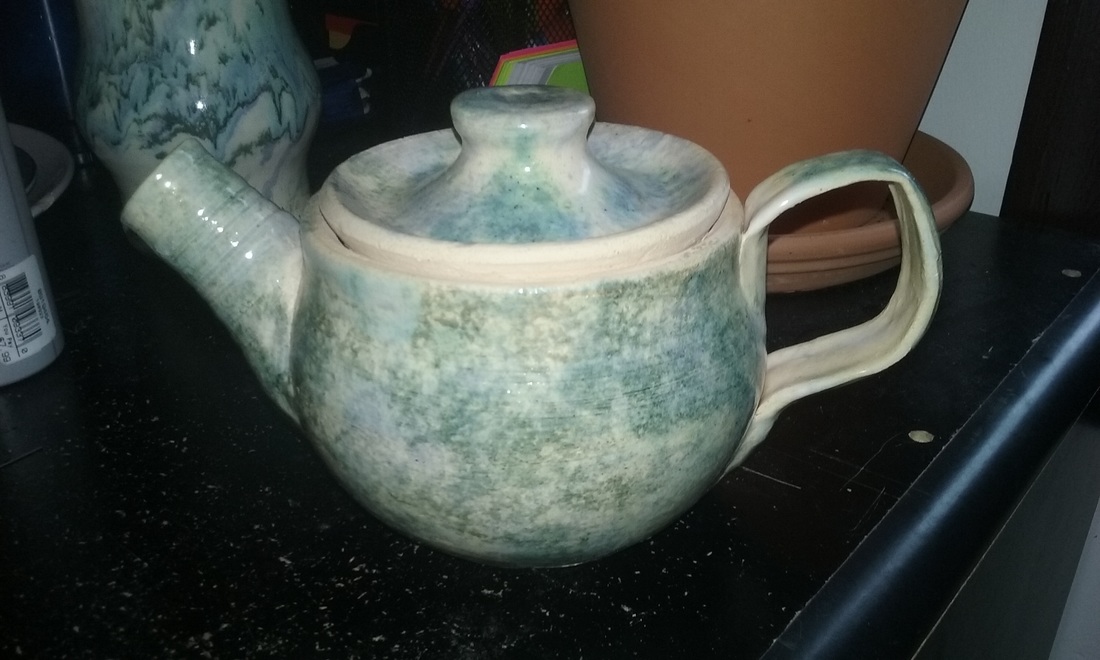
  This is my hand and wheel project thrown on the wheel. The teapot's surface is smooth and leads into a smooth inside as well. The teapot is 5 inches tall and 7 inches wide from spout to handle. The colors I used on this project was a white glaze, followed by a sponging of cobalt, toothpaste, and shadow green. A new skill I learned while making this project was throwing a spout. An art element I used on this project was shape, as the basin of the teapot is rounded and the spout and handle are connected into it smoothly. A design element I used on this project was pattern, as I decided to do a repeated design of sponge glazing rather than different glazing for different parts. A feeling I wanted to convey with this project was usability, as you can actually use this teapot to make tea.
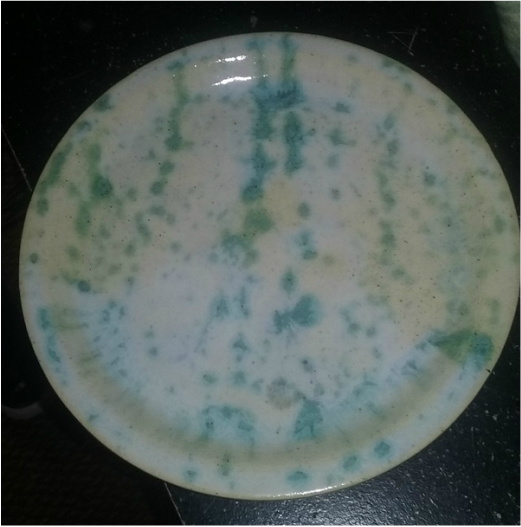
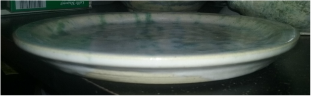
 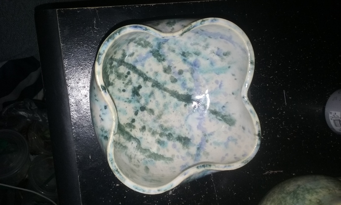 This is my wheel altered project thrown on the wheel. For this project, I decided to go with a basic bowl shape, and morphing the top at the suggestion of Ms. Heideman to give it the altered look. The project is 4 inches tall and 6 inches wide at it's maximum. The colors I used on this project was a white glaze, followed by a splatter of cobalt and shadow green. A new skill I learned during this project was completely altering the rim of a project, as I did for this, in order to distort it in a way that made it look like a bowl, but not like a bowl. An art element I used in this project was color, as with this I used a darker green a little more heavily, straying away from my toothpaste and cobalt combination. A design element I used in this project was movement, shown by the morphed lip. A mood or feeling I wanted to show in this project was differentiation, as a usual bowl has a perfect circular rim but with this it is wavy.
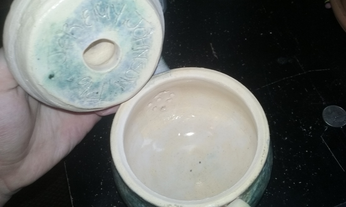
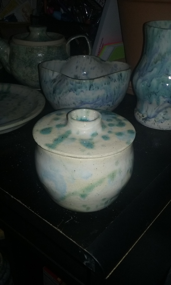 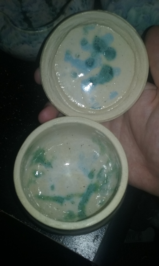 This is my lidded project thrown on the wheel. The project is 4 inches tall and 3.5 inches wide. The colors I used on this was my usual white glaze, followed by a splatter of turquoise, shadow green, and lavender even though it didn't show up. A new skill that I learned during this assignment was making a lid to the correct size so that it would sit on top of the project without looking unproportional. An art element I used during this assignment was color, shown by the turquoise glaze that I made for the project and made a different kind of blue inside. A design element I used on this project was unity, as the lid makes it seem like one single being, rather than two. A feeling or mood I wanted to convey was cute in a way that it is very different from last semesters lidded, and is a lot more put together.
|
AuthorWrite something about yourself. No need to be fancy, just an overview. Archives
May 2016
Categories |
 RSS Feed
